Follow the Signs to Safety – Your Guide to Evacuation Center Signage
When Lives Depend on Clear Directions
Evacuation center signage is a critical component of emergency management systems that guides people to safety during disasters, fires, and other crisis situations. Clear, visible signage can reduce evacuation times and potentially save lives when every second counts.
Key elements of effective evacuation center signage:
- Purpose: Guides people quickly to safety during emergencies
- Types: Assembly area signs, shelter directional signs, evacuation route markers, hazard zone warnings
- Materials: Photoluminescent (glow-in-the-dark), reflective aluminium, industrial-grade PVC
- Design features: High visibility, universal symbols, multilingual text, durability in harsh conditions
- Compliance: Must meet Australian Standards AS 1319 and local fire codes
In emergency situations, panic and confusion can overwhelm even the most level-headed individuals. Having clear, strategically placed evacuation signage creates a visual pathway to safety that can be followed instinctively, even when visibility is compromised or stress levels are high.
For facility managers and safety officers, implementing proper evacuation center signage isn't just about ticking a compliance box—it's about creating a reliable system that performs precisely when it's needed most.
When power fails during an emergency, photoluminescent evacuation signs can increase visibility by up to 100%, ensuring people can still find their way to safety in complete darkness. Meanwhile, signs constructed from industrial-grade materials withstand harsh conditions and remain legible for years, providing consistent guidance when it matters most.
Every business hopes to never face a catastrophic event, but as the saying goes: it's better to be prepared for a disaster than blindsided by one.
Why Evacuation Centre Signage Matters
In those critical moments when disaster strikes, clear guidance becomes not just helpful, but essential. Evacuation center signage serves as a silent yet powerful guide during chaotic situations, leading people to safety when confusion and panic might otherwise take over.
The most compelling reason for investing in quality evacuation signage is straightforward – it saves lives. Research has consistently shown that proper evacuation signage can reduce evacuation times by up to 50%. When you consider that mere seconds can determine survival during a fire, chemical spill or natural disaster, this statistic takes on profound significance.
Beyond immediate safety benefits, evacuation signage fulfils your duty-of-care obligations to everyone who enters your premises. Australian businesses aren't just morally responsible for protecting people – they're legally required to provide clear emergency guidance under workplace health and safety regulations.
What truly sets quality evacuation signage apart is its power-outage visibility. When electrical systems fail during emergencies (as they often do), photoluminescent signs continue guiding people to safety even in complete darkness. This redundancy can make all the difference when primary systems fail.
We've seen at Pinnacle Signage how proper evacuation signage transforms workplace safety culture. During a recent installation at a manufacturing facility in Newcastle, staff immediately noted how the new signage gave them confidence, knowing exactly where to go if disaster struck. This psychological benefit shouldn't be underestimated – when people know there's a clear path to safety, they remain calmer during actual emergencies.
Well-designed evacuation signage also builds community confidence. When customers, visitors and employees see visible safety measures throughout your facility, it silently communicates that their wellbeing is your priority. This creates trust that extends beyond emergency situations into everyday business relationships.
At Pinnacle Signage, we understand that compliant, effective evacuation signage represents more than just meeting regulatory requirements. It demonstrates a genuine commitment to protecting people when they're most vulnerable. While no business plans for disaster, every responsible organisation plans for safety – and clear evacuation guidance stands at the heart of that preparation.
The investment in quality evacuation signage pays dividends not measurable in dollars, but in something far more valuable – the potential to guide someone safely home during their worst day.
Know Your Signs – Evacuation Center Signage Types
Understanding the different types of evacuation center signage is crucial for creating a comprehensive emergency management system. Each sign serves a specific purpose in guiding people to safety when every second counts.

Assembly Area Signs
When chaos erupts during an emergency, assembly area signs (often called muster point signs) become guides of order. These green and white signs mark safe gathering spots where everyone should meet after evacuating a building.
What makes these signs effective isn't just their bright colours—it's thoughtful design. The best assembly area signs feature high-contrast elements that remain visible even in challenging conditions. They use bold, unmistakable text that clearly identifies the area as a designated assembly point.
In Australia's diverse communities, bilingual or multilingual text has become increasingly important. We've found that including distance indicators (like "Assembly Area 50m →") helps people gauge how far they need to go to reach safety.
Assembly areas should be positioned well away from the building, leaving clear access for emergency vehicles while providing enough space for everyone to gather safely.
Shelter Directional Signs
Not all emergencies call for open-air assembly points. During severe weather events like cyclones or violent storms, shelter directional signs guide people toward protected refuge areas.
These signs differ from standard evacuation markers by specifically indicating the type of shelter available. A good shelter sign includes clear directional arrows pointing toward the nearest protected area, often with distance information to help people make quick decisions.
For reliability in all conditions, these signs typically feature photoluminescent materials that continue glowing during power outages. The best outdoor versions use reflective aluminium that stands up to Australia's harsh weather while remaining visible day and night.
Australian emergency management guidelines recommend placing shelter directional signs no more than 5 kilometres from the actual shelter, maintaining consistent design throughout a region for instant recognition even by visitors unfamiliar with the area.
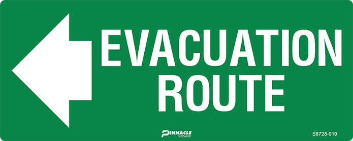
Evacuation Route Markers
Perhaps the most vital component of any evacuation system, route markers create a continuous path from any location to the nearest safe exit. These signs feature the internationally recognised running figure and exit symbol that's instantly understood regardless of language barriers.
The effectiveness of evacuation route markers hinges on continuity and strategic placement. They should appear at every decision point—intersections, stairwells, and doorways—creating an unbroken chain to safety. Once someone begins following these signs, they should never reach a point where the next direction isn't immediately clear.
In buildings where power failure is a concern during emergencies, photoluminescent materials ensure these critical markers remain visible even in complete darkness. This simple feature has proven lifesaving in countless emergency situations across Australia.
Hazard Zone & Warning Signs
While other signs guide people toward safety, hazard zone and warning signs serve as critical boundaries, alerting people to potential dangers and marking areas that could become hazardous during specific emergencies.
These distinctive signs—typically using eye-catching yellow/black or red/white colour schemes—communicate potential dangers quickly. Common examples include tsunami evacuation zone boundaries, flood-prone area warnings, chemical hazard demarcations, and fire danger alerts.
In coastal regions of Australia, tsunami evacuation route signs have become increasingly common, adopting standardised designs used throughout the Pacific region. This consistency ensures immediate recognition by both locals and visitors unfamiliar with the area.
For truly comprehensive emergency preparedness, facilities typically need a thoughtful combination of these sign types, strategically placed to create an intuitive evacuation system that works even under the most stressful conditions.
Scientific research on tsunami evacuation signage confirms what safety professionals have long understood: consistent, well-designed signage significantly improves public response during both evacuation drills and actual emergencies.
At Pinnacle Signage, we've seen how the right combination of evacuation signage creates confidence and clarity during emergency situations—when people need direction most.
Designing Effective and Compliant Evacuation Center Signage
Creating evacuation center signage that truly works during an emergency isn't just about ticking compliance boxes—it's about designing visual guidance that people can instinctively follow when stress levels are high and time is critical.

Visibility and Readability
When it comes to evacuation signage, visibility can make all the difference between a smooth evacuation and dangerous confusion.
Have you ever tried reading small print from across a room? It's nearly impossible. That's why we recommend text height of at least 6 mm for standard viewing distances. This size becomes readable at approximately 60 feet—perfect for corridor settings—though it remains visible (if not perfectly legible) from up to 200 feet away. For main evacuation routes, we often suggest larger text to ensure people can spot directions from greater distances.
Contrast matters enormously too. The classic white-on-green for evacuation routes and black-on-yellow for warnings aren't just traditional choices—they're scientifically proven to improve visibility under stress. We've seen how poor contrast choices can render otherwise well-designed signs nearly invisible during smoke tests.
Proper positioning at eye level (about 1.5-1.8 metres from the floor) ensures signs remain in the natural line of sight. You'd be surprised how many facilities place critical evacuation signage too high or in positions that become blocked by opened doors or temporary displays.
For a deeper dive into exactly how visibility changes with distance, the scientific research on readability distances provides fascinating insights that guide our design decisions.
Photoluminescent Evacuation Center Signage
We've all experienced those moments when the power suddenly cuts out, plunging everything into darkness. Now imagine that happening during an emergency evacuation. That's where photoluminescent signage truly shines—quite literally.
These remarkable materials absorb ambient light throughout the day and then emit a steady glow when darkness falls. The technology has transformed evacuation safety, providing a visible pathway even when all power systems fail.
Here in Australia, our photoluminescent signs must meet strict AS/NZS 2293 standards, which specify minimum luminance levels and durability requirements. But at Pinnacle Signage, we don't just meet these standards—we exceed them. Our premium photoluminescent materials maintain visibility for hours after lights go out, giving people the guidance they need even in complete darkness.
One property manager in Brisbane told us how their photoluminescent stairwell signs made all the difference during a building-wide power failure. "The glowing path was like having someone hold your hand through the darkness," she said. "It completely changed how we think about emergency preparedness."
Materials That Last
Evacuation signage isn't a "set and forget" solution—it needs to withstand years of exposure while maintaining perfect visibility. The materials you choose directly impact how well your signs perform when they're needed most.
For outdoor applications, marine-grade aluminium is our go-to recommendation. It stands up beautifully to Australia's harsh sun, coastal salt spray, and everything in between. We've installed these signs at beachfront properties where ordinary materials would have deteriorated within months.
Indoor settings offer more flexibility, with 3 mm PVC providing an excellent balance of durability and cost-effectiveness. For areas with heavy foot traffic or industrial activity, our reinforced floor signs can withstand even forklift traffic without degrading.
The inks matter just as much as the base materials. Our UV-stable formulations resist fading even in direct sunlight, ensuring your evacuation routes remain clearly visible year after year. For additional protection and improved visibility, vinyl overlays can significantly extend sign life while improving reflectivity.
Language, Symbols & Accessibility
A truly effective evacuation system speaks to everyone, regardless of language barriers or disabilities. This inclusive approach isn't just good practice—it's essential for comprehensive safety.
The power of ISO-standardised symbols cannot be overstated. These universally recognised pictograms communicate instantly, even to people who don't speak English. The running figure, directional arrows, and assembly point symbols work across cultural and language barriers.
In Australia's wonderfully diverse communities, multilingual text often makes perfect sense. We've created evacuation signage for facilities in Sydney and Melbourne with directions in up to four languages, ensuring everyone understands exactly where to go during an emergency.
Inclusive design goes beyond languages to address physical needs as well. Braille and tactile elements provide crucial guidance for visually impaired individuals. These raised components allow people to literally feel their way to safety when visual cues aren't accessible.
Above all, we champion simple, direct wording on all evacuation signage. When adrenaline is pumping and decisions must be made quickly, complex instructions can cause dangerous delays. "Exit This Way" will always outperform "In The Event Of Emergency, Please Proceed In This Direction."
For more detailed information about exit and fire signage requirements, check out our comprehensive guide to exit & fire signs.
Creating truly effective evacuation center signage requires balancing technical requirements with human psychology. When designed thoughtfully, these silent guides stand ready to lead people to safety during their most vulnerable moments—a responsibility we never take lightly at Pinnacle Signage.
Placement, Installation and Relevant Standards
Proper placement and installation of evacuation center signage isn't just a box-ticking exercise – it's what makes the difference between signs that save lives and signs that go unnoticed during an emergency.
Strategic Placement Guidelines
When it comes to positioning your evacuation signs, think like someone who's never been in your building before. Where would they naturally look for guidance?
The most effective placement happens at decision points – those moments where someone might pause and wonder "which way do I go?" This includes corridor intersections, stairwell entrances, and exits from large open spaces.
For typical indoor corridors, we recommend placing signs every 15-20 metres to maintain a visual connection as people move through the space. Maintaining consistent mounting heights (typically 1.5-1.8 metres from the floor) creates a predictable visual pattern that's easier to follow during stressful situations.
One of the most common mistakes we see is the broken arrow sequence – where directional arrows lead people partway to safety before mysteriously disappearing. Your arrows should create a continuous, logical path without contradictions or dead ends.
For outdoor evacuation routes, the MUTCD Chapter 2N recommends placing signs 150-300 feet ahead of any turn. This gives people enough time to register the direction change without creating confusion.
Installation Methods and Considerations
A beautifully designed sign that falls off the wall during an emergency isn't much help to anyone. That's why proper installation is just as important as the sign itself.
Before mounting any evacuation signage, ensure your surfaces are clean, dry and debris-free. This seems obvious, but it's surprising how often this basic step gets overlooked in busy installation schedules.
Choose your mounting hardware based on your specific wall material – masonry anchors for concrete, toggle bolts for plasterboard, and so on. For outdoor signs in windy areas (particularly important along Australia's coastal regions), factor in additional reinforcement for larger signs.
In public spaces, vandal-resistant fixings are worth the extra investment. They prevent unauthorised removal and ensure your evacuation guidance stays exactly where it needs to be.
After installation, we always recommend conducting a visibility test under various lighting conditions. What looks perfectly visible during daylight hours might be completely lost in low light or when viewed from certain angles.
Compliance with Australian Standards
Navigating Australian compliance requirements doesn't need to be complicated, but it does require attention to detail. Your evacuation signage needs to meet several key standards:
AS 1319:1994 covers the design principles, colours and symbols for safety signs in occupational environments. This standard ensures consistent visual language across different facilities.
AS 2293 specifically addresses emergency escape lighting and exit signs, including illumination requirements and placement guidelines.
The Building Code of Australia contains provisions for emergency egress and signage that vary depending on your building's classification.
Your local fire codes may impose additional requirements specific to your region – particularly important in bushfire-prone areas of Australia.
At Pinnacle Signage, we stay current with all these standards so you don't have to become a regulatory expert yourself. Compliance isn't just about avoiding fines – it ensures your evacuation signage will perform exactly as intended when you need it most.
Custom Evacuation Center Signage for Your Facility
While standardisation helps with recognition, we understand that every facility has unique challenges. A hospital has different evacuation requirements than a shopping centre, and a multi-building university campus needs a different approach than a single office building.
For larger facilities with complex layouts, custom evacuation maps often complement standard directional signage. Rural properties might need more weather-resistant materials and higher visibility features than their urban counterparts.
Many of our clients ask about incorporating their brand colours into evacuation signage. This is certainly possible, but we always prioritise clarity and effectiveness over aesthetics. The good news is that thoughtful design can often achieve both – maintaining compliance while reflecting your organisation's visual identity.
Facilities with unique hazards – whether chemical storage, high-voltage equipment or specialised machinery – often need customised warning signs beyond standard evacuation guidance. We can help identify these special requirements and integrate them into your overall evacuation signage plan.
More info about custom signage services
Keeping Everyone in the Loop – Maps, Wayfinding and Diverse Needs
Comprehensive evacuation center signage isn't just about pointing people to the exits—it's about creating a system that works for everyone, regardless of their abilities or background. After all, during an emergency, no one should be left trying to figure out which way to safety.

Evacuation Maps and Floor Plans
There's something instantly reassuring about seeing a well-designed evacuation map when you enter a building. These visual guides serve as the "big picture" component of your emergency wayfinding system.
The most effective evacuation maps include a clear "You-are-here" marker that immediately orients visitors. This simple feature can significantly reduce the crucial seconds spent figuring out where you are in relation to the nearest exit.
Good evacuation maps use colour strategically—typically highlighting primary evacuation routes in green and alternative routes in a contrasting colour. This visual hierarchy helps people quickly identify their best escape option. Assembly points should be prominently marked, showing people not just how to get out, but where to gather once they're safe.
We've found that simplicity is key with evacuation maps. Too much detail creates confusion, especially during stressful situations. That's why our designers at Pinnacle Signage focus on showing only essential elements like emergency equipment locations and major landmarks.
Placement matters too. These maps work best at natural decision points—building entrances, lift lobbies, and major corridor intersections. When people pause to consider which way to go, that's precisely when they need this guidance most.
Addressing Diverse Needs
An effective evacuation system recognises that not everyone experiences a building the same way. Some of your visitors or staff may have mobility challenges, vision impairments, or may not speak English as their first language.
Multilingual information can be a literal lifesaver in diverse communities. In areas with significant cultural diversity, consider including key instructions in the languages most commonly spoken by your visitors or staff.
Universal symbols transcend language barriers entirely. The running figure heading toward an exit is instantly recognisable worldwide, making it an essential component of inclusive signage.
For visitors with vision impairments, Braille and tactile elements provide crucial guidance. These features aren't just thoughtful additions—they're essential components of a truly inclusive safety system.
People with mobility challenges need clearly marked wheelchair-accessible routes that avoid stairs and other obstacles. These routes should be prominently identified on maps and directional signage throughout your facility.
For those with hearing impairments, visual cues become even more critical during emergencies when audible alarms might not be effective. Flashing lights and clear visual signage ensure everyone receives the alert, regardless of their hearing ability.
Digital & Physical Wayfinding Integration
Modern evacuation systems increasingly blend traditional signage with digital elements, creating layers of guidance that work together seamlessly.
QR codes on static signs can link to more detailed evacuation instructions or interactive maps on smartphones. This allows for much more information than could fit on a physical sign, while still maintaining the critical at-a-glance guidance that traditional signage provides.
Some facilities are now implementing mobile apps that provide real-time evacuation guidance, even showing customised routes based on a person's current location within the building. These apps can be particularly helpful in large, complex facilities like hospitals or university campuses.
Digital displays offer the advantage of adaptability—they can change their message based on the specific emergency or show different evacuation routes if certain pathways become blocked.
However, it's crucial to maintain redundancy in your system. Digital solutions, while powerful, can fail during power outages or when infrastructure is damaged. Traditional, non-powered signage should always form the backbone of any evacuation system, with digital elements serving as improvements rather than replacements.
Training and Familiarisation
Even the best signage system works better when people have seen it before an emergency occurs. Regular evacuation drills help everyone recognise and follow signage instinctively, rather than having to figure it out under pressure.
Including information about evacuation procedures in orientation sessions for new employees or visitors helps build awareness from day one. Brief refresher training sessions can keep these critical procedures top of mind for everyone in your facility.
This combination of clear, inclusive signage and practical training creates a comprehensive approach to emergency preparedness. It's not just about meeting compliance requirements—it's about genuinely looking after everyone who enters your building.
At Pinnacle Signage, we understand that effective evacuation signage is about more than just pointing people to the nearest exit—it's about creating a system that works for everyone, especially when it matters most.
Maintenance, Integration & Common Pitfalls
Keeping your evacuation center signage in top condition isn't just good practice – it's essential for safety. Like any critical safety system, your signs need regular attention to ensure they'll perform when you need them most.
Maintenance and Inspection
We've all seen those faded, barely legible signs that make you squint and guess what they're trying to communicate. In an emergency, that's the last thing you want people doing.
Regular six-monthly checks should be part of your safety calendar. During these inspections, look for signs that have faded, been damaged, or gone missing entirely. You'd be surprised how often signs disappear during renovations or get accidentally removed during cleaning.
For photoluminescent signs, cleaning is particularly important. These signs need to absorb light to function properly, and a layer of dust can significantly reduce their effectiveness. A simple wipe-down with a non-abrasive cleaner can make all the difference between a sign that glows brightly and one that barely shimmers in the dark.
Outdoor signs cop a beating from our harsh Australian sun and weather. UV damage can fade colours and make critical information illegible within a couple of years. If your facility is near the coast, salt corrosion can also take its toll on fixings and materials.
Keeping detailed records of your sign inspections isn't just good practice – it's often required for compliance and insurance purposes. A simple log noting inspection dates, findings, and any replacements made can save headaches during safety audits.
Integration with Emergency Management Plans
Your evacuation signs shouldn't exist in isolation – they're one piece of your broader emergency response puzzle. The most effective signage systems work hand-in-hand with your emergency procedures.
When we install evacuation signage at Pinnacle Signage, we always recommend reviewing your emergency management plan to ensure consistency. There's nothing more confusing during an evacuation than having your floor warden directing people one way while your signs point in another direction.
Staff familiarity with your signage system is crucial. During orientation, make sure new employees understand how to "read" your evacuation signs and where they lead. This becomes second nature with regular drills, allowing people to follow signs instinctively when stress levels are high.
For visitors who aren't familiar with your building, clear signage becomes even more critical. Consider adding brief information about emergency exits to visitor badges or reception materials, drawing attention to the evacuation signage they might need to follow.
Common Pitfalls to Avoid
Even well-designed evacuation signage systems can fall short if they fall into common traps. We've seen these issues repeatedly over our years in the industry, and they're surprisingly easy to avoid with a bit of foresight.
Mixing icon styles creates unnecessary confusion. We once visited a hospital that had three different styles of running figure exit signs – some were the ISO standard, others were older Australian designs, and some were American imports. This inconsistency forces people to interpret different symbols in an emergency – exactly when you want recognition to be automatic.
Poor contrast is another frequent issue, particularly with signs that have been in place for years. What started as crisp white text on a green background can fade to a barely distinguishable pale green on lighter green. Regular replacement before signs deteriorate this far is essential.
Outdated information after renovations is surprisingly common. We've seen evacuation routes that lead directly into newly constructed walls or storage areas. After any significant building changes, a complete signage review is essential.
Overcomplicating signs with too much information slows down comprehension. In an emergency, people scan rather than read, so keeping messages simple and direct improves response time.
Gaps in coverage create confusion points where people might hesitate or make wrong turns. A comprehensive evacuation signage system should provide continuous guidance from any point in your facility to the nearest exit.
Improper mounting heights can render signs practically invisible. Signs mounted too high might be missed by someone looking ahead at eye level, while signs mounted too low might be obscured by furniture or crowds.
Updating After Changes
Buildings aren't static – they evolve over time. Your evacuation signage needs to evolve with them.
After renovations, don't just focus on the area that's changed. Consider how modifications affect overall evacuation routes. A new wall might mean people need to turn left instead of right, requiring changes to signs in adjacent areas as well.
Changes in building use can also necessitate signage updates. Converting warehouse space to office use, for example, typically means more occupants and potentially different evacuation needs.
Regulatory standards also change periodically. Staying current with Australian Standards ensures your evacuation signage remains compliant and effective. At Pinnacle Signage, we keep our finger on the pulse of changing regulations so you don't have to.
Perhaps most valuable are the lessons learned from drills or actual evacuations. If people consistently miss a particular turn or express confusion about certain signs, that's valuable feedback for improving your system. The best evacuation signage evolves based on real-world experience.
By treating your evacuation signage as a living system rather than a one-time installation, you ensure it remains effective throughout your facility's lifetime – ready to guide people to safety when every second counts.
Frequently Asked Questions about Evacuation Centre Signage
Do I need illuminated signs if the building already has emergency lighting?
While emergency lighting helps illuminate pathways during a crisis, it doesn't actually tell people which way to go. Evacuation center signage serves a completely different purpose by providing clear directions, identifying exits, and marking assembly points where people should gather once outside.
Think of it this way: emergency lighting shows you the path, but evacuation signs tell you which path to take. For truly comprehensive safety, we recommend a layered approach that includes standard emergency lighting, photoluminescent signs that continue working even if backup power fails, and reflective floor-level markers that remain visible beneath smoke during fire emergencies.
This redundancy is more than just ticking boxes—it could make all the difference if one system fails during a genuine emergency. We've seen cases where this multi-layered approach helped people evacuate safely even when primary systems were compromised.
How often should evacuation signs be inspected and replaced?
A good rule of thumb is to formally check your evacuation signs every six months. You should also conduct additional inspections after any significant event that might affect their condition—like renovations, water damage, or even after moving large equipment through corridors.
During these inspections, you'll want to verify that your signs remain securely mounted, clearly visible, undamaged, and legible. It's also important to confirm they still accurately reflect your current building layout and evacuation procedures.
As for replacement schedules, several factors come into play. Indoor signs typically serve you well for 5-7 years before needing replacement, while outdoor signs often need refreshing every 3-5 years due to exposure to the elements. Signs in busy corridors or industrial areas might need more frequent replacement due to accidental damage or wear and tear.
At Pinnacle Signage, we offer maintenance programs that take the guesswork out of this process. Our scheduled inspections and replacement services ensure your evacuation signage remains effective throughout its entire lifecycle—giving you one less safety concern to worry about.
Can I add company branding without breaching compliance rules?
Yes, you can incorporate your brand identity into evacuation signage while still maintaining compliance—but safety must always take priority over marketing considerations.
Primary evacuation signs like exit markers and directional arrows should strictly follow standards without modification. However, evacuation maps offer more flexibility, allowing subtle branding elements in non-critical areas. Assembly point signs can sometimes incorporate your logo in a secondary position, provided the main safety message remains crystal clear.
Some of our clients have successfully used custom colours for border elements or non-critical areas of evacuation signage, while maintaining the required colours (typically green and white) for the essential safety elements.
The golden rule is simple: branding should never compromise the immediate recognition and understanding of the sign's safety message. When faced with a choice between compliance and branding, always prioritise safety—it's not just about avoiding fines, it's about potentially saving lives.
Our design team at Pinnacle Signage has extensive experience balancing brand identity with safety requirements. We can help you develop evacuation signage that reflects your company's visual identity while fully meeting all regulatory requirements.
Safety Starts with Smart Signage
Effective evacuation center signage represents far more than regulatory compliance—it's a vital system that guides people to safety when emergencies strike. From photoluminescent materials that glow in darkness to strategically placed directional markers that create continuous paths to safety, every element plays a crucial role in a comprehensive evacuation system.
As we've explored throughout this guide, several key factors contribute to successful evacuation signage:
- Visibility and clarity: Signs must be immediately recognisable and understandable, even under stress.
- Strategic placement: Continuous guidance without gaps or confusion points.
- Appropriate materials: Durability and performance matched to the environment.
- Inclusivity: Addressing the needs of all building occupants, including those with disabilities.
- Integration: Coordination with broader emergency management systems.
- Maintenance: Regular inspection and updating to ensure continued effectiveness.
At Pinnacle Signage, we understand that every facility has unique evacuation challenges and requirements. Our approach combines Australian standards compliance with practical, real-world experience to create signage systems that perform when they're needed most.
The investment in quality evacuation signage pays dividends in safety and peace of mind. Knowing that your staff, customers, and visitors can quickly find their way to safety during an emergency is invaluable—and potentially lifesaving.
Evacuation signage is not a "set and forget" solution. It requires ongoing attention through regular drills, maintenance checks, and updates as your facility evolves. By treating evacuation signage as an integral part of your safety culture, you create an environment where everyone knows how to find their way to safety when every second counts.