Caution vs Danger vs Warning: What’s the Difference?
Why Caution Warning Signs Are Essential for Workplace Safety
Caution warning signs are vital safety tools that alert people to potential hazards that could cause minor to moderate injuries. These yellow signs with black text serve as the first line of defence against workplace accidents, communicating risks that aren't immediately life-threatening but still require attention and care.
Quick Answer: Types and Uses of Caution Warning Signs
- Slippery Surface Signs - Wet floors, cleaning areas, outdoor walkways
- Electric Shock Warning Signs - Electrical panels, maintenance areas, power equipment
- Hot Water Signs - Kitchen areas, boiler rooms, industrial processes
- Uneven Surface Signs - Construction zones, damaged flooring, outdoor paths
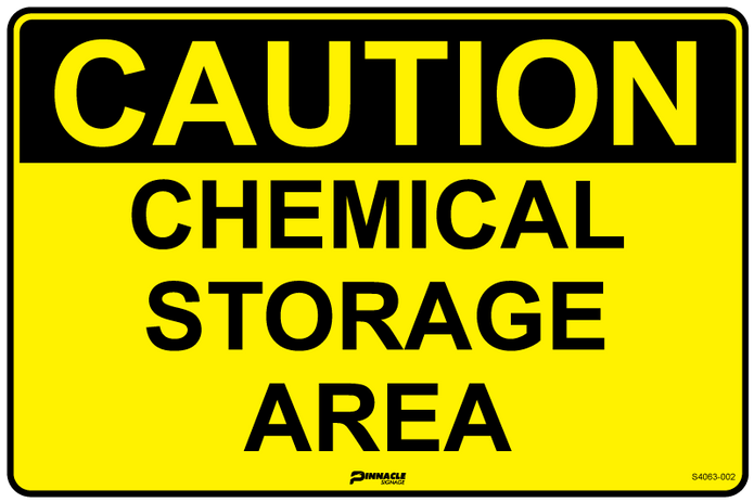
- Chemical Storage Signs - Storage rooms, laboratory areas, cleaning cupboards
- Forklift Zone Signs - Warehouses, loading docks, industrial facilities
- Low Ceiling Signs - Basement areas, mezzanine levels, loading bays
The key difference between caution, warning, and danger signs lies in risk severity. Caution signs address hazards that may cause minor injuries like cuts or bruises. Warning signs indicate more serious risks that could lead to significant injury. Danger signs mark life-threatening hazards requiring immediate action.
Why Yellow Works So Well
Yellow grabs attention without triggering panicit's one of the most visible colours to human eyes, especially in peripheral vision. Combined with bold black text and symbols, yellow signs command attention quickly, making them perfect for everyday hazards like spills, uneven ground, or restricted zones.
Whether you manage a warehouse, construction site, office, or retail space, the right caution sign can mean the difference between someone noticing a hazard or walking straight into it.
I'm Doug Lindqvist, General Manager of Pinnacle Signage, and I've spent years in the safety and industrial supply space helping Australian businesses steer their signage requirements. Through my experience, I've seen how proper caution warning signs can prevent accidents and protect both workers and visitors from harm.
Caution Warning Signs 101: Definition, Purpose & Risk Levels
Caution warning signs are your workplace's friendly but firm reminders that hazards exist, even if they won't necessarily land someone in hospital. These yellow guardians serve a crucial role in Australian workplaces - they're the difference between someone carefully navigating a wet floor and ending up flat on their back with a bruised ego (and tailbone).
Think of caution warning signs as the middle child of safety signage. They're not as dramatic as their red "DANGER" siblings, nor as intense as the orange "WARNING" signs, but they're absolutely essential for day-to-day safety management. According to Safe Work Australia guidelines, these signs must clearly communicate potential hazards that could result in minor to moderate injuries if proper precautions aren't taken.
The psychology behind that distinctive yellow colour isn't accidental. Yellow sits right in the sweet spot of human vision - it's one of the most visible colours to our eyes, especially when we're not looking directly at something. Unlike red, which can trigger panic responses, yellow signals "pay attention" without making people think the building's about to explode.
In the Australian Work Health and Safety (WHS) context, caution warning signs fill a vital gap in risk communication. They address those everyday hazards that might not make headlines but can still cause real harm - the wet floors after cleaning, the uneven surfaces in loading areas, or the low-hanging pipes in older warehouses.
| Sign Type | Background Colour | Risk Level | Typical Response | Injury Potential |
|---|---|---|---|---|
| Caution | Yellow | Minor to moderate hazards | Exercise care, take precautions | Cuts, bruises, minor strains |
| Warning | Orange | Serious hazards | Heightened awareness, specific safety measures | Significant injury or illness |
| Danger | Red | Life-threatening hazards | Immediate caution, possible exclusion | Death or permanent disability |
What Are Caution Warning Signs?
Caution warning signs are the workhorses of workplace safety communication. They use the signal word "CAUTION" to alert people to potential hazards that require attention but won't necessarily send you to the emergency room if you encounter them carefully.
These signs have a distinctive look that's instantly recognisable across Australian workplaces. The yellow background creates maximum visibility, while the black header strip with bold "CAUTION" text ensures the message cuts through workplace noise and distractions.
The primary purpose is injury prevention through hazard awareness. When someone spots a caution sign, it's their cue to slow down, assess what's happening, and adjust their behaviour accordingly.
Caution Warning Signs vs Danger & Warning Signs
Understanding where caution warning signs fit in the safety signage hierarchy is crucial for proper workplace risk management. Getting this wrong doesn't just create confusion - it can lead to people either ignoring real dangers or overreacting to minor hazards.
Caution signs handle the everyday stuff - those minor to moderate risks that are part of normal workplace operations. We're talking about wet floors during cleaning, uneven surfaces near construction zones, or low ceilings in storage areas.
Warning signs step up the game with their orange backgrounds, addressing serious hazards that could cause significant harm. Think moving machinery, biohazard areas, or chemical exposure risks.
Danger signs are the heavy hitters with their unmistakable red backgrounds. These mark life-threatening hazards like high voltage areas, confined spaces, or toxic gas zones.
The colour coding follows both OSHA standards and ISO guidelines, based on decades of research into human psychology and colour perception. This hierarchy isn't just bureaucratic box-ticking - it's about effective risk communication that helps people make split-second decisions about how to respond to different workplace hazards.
Design Standards & Symbols for Caution Warning Signs
Getting caution warning signs right isn't just about slapping yellow paint on a board and calling it done. There's actually a whole science behind what makes these signs effective, and it all comes down to following proven design standards that have been refined over decades.
OSHA 1910.145 sets the foundation here in Australia and internationally, mandating that caution signs must use yellow backgrounds with black panels and yellow letters for maximum visibility and recognition. The technical requirements go deeper than you might expect. Yellow background colours must meet ANSI Z53.1-1967 specifications to ensure consistency across different manufacturers and environments.
What's particularly important for Australian workplaces is that ISO 3864-1:2011 provides international standards for safety colours and signs. This means your caution warning signs will be understood by workers regardless of their cultural background - crucial in our multicultural work environments.
Colours, Shapes & Typography That Work
The magic of effective caution signage happens when all the design elements work together seamlessly. Yellow isn't just eye-catching - it's scientifically proven to be the most attention-grabbing colour in peripheral vision. Research shows that yellow signs are noticed 1.5 times faster than other colours.
The black-on-yellow combination provides optimal contrast for readability across various lighting conditions, from bright outdoor construction sites to dimly lit warehouse corners. Shape and layout follow specific principles too. The rectangular format maximises text space while maintaining readability, while black triangles containing hazard pictograms create instant visual recognition.
Typography standards might seem like overkill, but they're based on real-world testing. Sans-serif fonts provide maximum readability, especially at distance or in poor lighting. Minimum letter heights are calculated based on viewing distance, while bold text for the signal word "CAUTION" ensures it stands out even when people are moving quickly past the sign.
Common Symbols & Meanings on Caution Warning Signs
One of the brilliant things about modern caution warning signs is how they use standardised pictograms that work regardless of language barriers. In Australian workplaces where you might have team members speaking dozens of different languages, these visual symbols become absolutely essential.

The slippery surface symbol shows a figure slipping and is instantly recognisable for wet floors, icy conditions, or any surface with reduced traction. The electrical hazard symbol uses a lightning bolt to indicate risk of electric shock from equipment or exposed wiring.
Hot surface symbols featuring thermometers or flame icons warn of burn risks from heated equipment, while uneven surface symbols show stepped or irregular ground profiles to alert people to trip hazards. For industrial environments, chemical storage symbols using test tubes indicate the presence of stored chemicals requiring caution, while forklift zone symbols warn pedestrians about vehicle traffic areas.
These symbols follow international standards, making them instantly recognisable whether someone grew up in Melbourne, Manila, or Mumbai. That universal recognition can be the difference between a safe day at work and a preventable accident.
Where & When to Use Caution Warning Signs
Caution warning signs are workhorses in Australian industries, quietly preventing accidents across diverse environments every single day. From busy construction sites to quiet office buildings, these yellow sentinels serve as constant reminders to slow down and pay attention.
Construction Sites present some of the most obvious applications for caution signage. Walk through any active building site and you'll encounter uneven surfaces from recent excavation, wet concrete that's still curing, temporary electrical installations, and material storage zones where a moment's inattention could lead to injury.
For construction managers looking to ensure comprehensive site safety, our detailed guide on caution signs you can't miss on a construction site covers everything from regulatory requirements to strategic placement.
Warehouses and distribution centres face unique challenges with mixed pedestrian and vehicle traffic creating constant potential for accidents. Forklift operating zones need clear boundaries, loading docks present multiple hazards, and overhead storage areas pose risks from falling objects.
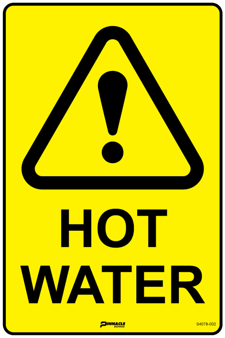
In laboratories and chemical storage facilities, the risks might be less obvious but equally important. Hot water systems, electrical equipment, compressed gas storage, and chemical storage areas all require specific caution signage to protect both trained staff and occasional visitors.
Retail and hospitality venues must balance customer experience with safety requirements. Wet floors after cleaning, kitchen areas with hot water systems, basement storage access, and outdoor dining areas with uneven surfaces all need appropriate signage.
Examples of Caution Warning Signs in Action
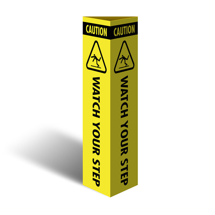
The beauty of caution warning signs lies in their everyday applications. Take the humble "Slippery When Wet" sign—deployed in restaurants after mopping, office buildings during cleaning, and retail stores during maintenance. These simple yellow A-frames prevent countless slip-and-fall incidents.
Electrical hazard areas showcase another common application. "Risk of Electric Shock" signs protect people in maintenance areas, near electrical panels, and around power equipment. While these situations aren't immediately life-threatening like high-voltage dangers, they still pose real risks of minor electrical shock or burns.
Hot water systems in commercial kitchens, boiler rooms, and industrial processes require caution signs to prevent burns from heated surfaces or steam. Uneven surface warnings address one of the most common workplace hazards—trips and falls. Construction sites, older buildings, and outdoor areas use these signs to alert pedestrians to surface irregularities.
Best Practices for Placement & Maintenance
Getting the most from your caution warning signs requires thoughtful placement and consistent maintenance. The best sign in the world won't help if it's positioned where nobody can see it or if it's so faded that the message is illegible.
Strategic placement starts with positioning signs at eye level—typically between 1.4 and 1.7 metres high for maximum visibility. Ensure clear sight lines from all approach angles, and place signs close enough to hazards to be relevant but far enough away to give people time to respond appropriately.
Lighting plays a crucial role in sign effectiveness. Adequate illumination ensures visibility during all working hours, while reflective materials help in low-light conditions. For large areas or spaces with multiple approach routes, don't hesitate to use multiple signs.
Maintenance schedules should include monthly visual inspections for damage, fading, or obstruction. Replace damaged or illegible signs immediately rather than waiting for the next scheduled inspection. Regular cleaning maintains both visibility and professional appearance.
Material selection matters more than many people realise. Corflute works well for temporary or indoor applications, while aluminium provides durability for permanent outdoor installations. The key is matching the sign material to the environment and expected lifespan.
Compliance, Training & Integrated Safety Strategy
Caution warning signs work best when they're part of a bigger safety picture, not just yellow signs scattered around your workplace. Think of them as one piece of a safety puzzle that includes training, regular maintenance, and clear communication with everyone who steps foot on your site.
Under Australian workplace health and safety regulations, employers have a duty of care that goes well beyond just putting up signs. You need to make sure people actually understand what those signs mean and know how to respond appropriately. Safe Work Australia is pretty clear on this - providing information, instruction, training, and supervision isn't optional.
The magic happens when caution warning signs work alongside other safety measures. Regular toolbox talks where you explain what different signs mean, digital checklists for checking signs are still visible and intact, and multilingual training materials for diverse workforces all make your signage more effective.
For a deeper dive into creating comprehensive workplace safety strategies, check out our guide on workplace safety signs that speak louder than words.
Legal Requirements & Penalties for Non-Compliance
Let's be honest - nobody enjoys talking about compliance and penalties, but understanding your legal obligations around caution warning signs can save you significant headaches down the track. Australian WHS regulations require employers to take reasonably practicable steps to eliminate or minimise workplace risks, and proper signage is a fundamental part of meeting this duty.
The key regulatory requirements aren't complicated, but they are important. Your signs must meet Australian Standards for design and placement - that means the right colours, sizes, and positioning. You'll need to establish regular inspection and maintenance schedules because a faded or damaged sign is about as useful as no sign at all. Employee training on sign recognition and response is mandatory, not suggested.
For businesses with international operations, OSHA 1910.145 adds another layer of requirements. Caution warning signs must use yellow backgrounds with black text, all employees must understand what caution signs mean, signs need rounded corners without sharp projections, and minimum size and visibility requirements must be met.
The potential penalties for non-compliance can sting. Workplace safety improvement notices, financial penalties for serious breaches, increased insurance premiums following preventable incidents, and legal liability if someone gets hurt because of inadequate signage.
Educating Staff & Visitors to Respond Correctly
The best caution warning signs in the world won't prevent accidents if people don't understand them or know how to respond appropriately. Creating effective education programs requires thinking about different groups of people and their varying needs.
New worker orientation should cover the basics - recognising different sign types and colours, understanding appropriate responses to various caution scenarios, knowing how to report damaged or missing signs, and accepting personal responsibility for safety awareness.
Regular refresher training keeps safety awareness sharp. This includes updates when signage standards change or new workplace hazards emerge, incident reviews that highlight why sign compliance matters, multilingual resources for non-English speaking workers, and practical exercises in hazard recognition.
For workplaces with regular visitors, clear signage at entry points explaining what different signs mean sets expectations from the start. Visitor safety briefings should include sign recognition, escort procedures for high-risk areas, and readily available emergency response information.
Modern safety programs increasingly use digital tools to improve traditional signage. QR codes on signs can link to detailed safety information in multiple languages, mobile apps allow quick reporting of sign maintenance issues, and online training modules make education accessible from any device.
Frequently Asked Questions about Caution Warning Signs
What size should an indoor caution warning sign be?
Choosing the right size for your indoor caution warning signs depends on where people will be when they first need to spot the hazard. It's not just about making signs big enough to read - it's about giving people enough time to react safely.
For close-up hazards like electrical panels or small equipment, 200mm x 300mm signs work perfectly. These compact signs are ideal when someone needs to be within arm's reach to encounter the risk.
Medium signs at 300mm x 450mm are your go-to choice for most workplace situations. Think wet floors in office buildings, uneven surfaces in warehouses, or low-hanging obstacles in storage areas. These signs strike the right balance between visibility and practicality.
When you're dealing with large open areas like warehouse floors or loading docks, 450mm x 600mm signs or larger become essential. The further away someone might be when they first encounter the hazard, the bigger your sign needs to be.
Consider your specific environment too. Poor lighting means you might need to go one size larger than usual. High-traffic areas where people are moving quickly also benefit from oversized signage.
How often must caution signs be inspected or replaced?
Your caution warning signs are only effective when they're clearly visible and properly positioned. Regular maintenance isn't just good practice - it's essential for keeping your workplace safe and compliant.
Monthly walk-throughs should become part of your routine safety checks. Look for signs that have been knocked askew by forklifts, faded from sun exposure, or partially blocked by new equipment. Weather can be particularly harsh on outdoor signage, with Australian conditions causing rapid deterioration if you're not vigilant.
Some situations demand immediate replacement. If text becomes illegible due to damage or fading, don't wait for your next scheduled inspection - replace it straight away. The same goes for signs that have become loose, been damaged by impact, or are no longer relevant because workplace conditions have changed.
Annual reviews give you the bigger picture. This is when you assess whether your overall signage program is working effectively. Are there new hazards that need signs? Have workflow changes made some signs obsolete?
Keep records of your inspection activities. Document when signs were checked, what issues were found, and what replacements were made. This documentation proves due diligence if workplace safety regulators come calling.
Can I customise caution signs without breaching compliance rules?
Absolutely - caution warning signs can be customised to your specific workplace needs while staying within safety regulations. The trick is understanding which elements are set in stone and which ones offer flexibility.
The yellow background and black "CAUTION" header aren't negotiable - these colour standards exist for good reason and are mandated by safety regulations. The basic design principles that make caution signs instantly recognisable must remain intact.
Where you can get creative is in the details that make signs more effective for your specific situation. Adding multiple languages is particularly valuable in Australian workplaces with diverse teams. Including your company logo in an appropriate spot can reinforce ownership and responsibility.
QR codes are becoming increasingly popular for linking to detailed safety procedures or reporting systems. Emergency contact information, specific instructions for your workplace, or additional safety reminders can all be incorporated thoughtfully.
The best custom signs improve safety communication rather than complicating it. Your customisation should make the core safety message clearer and more relevant, not buried under additional information.
At Pinnacle Signage, we work with businesses across Australia to create custom caution warning signs that meet both regulatory requirements and specific workplace needs. Our design team ensures your customisation improves safety effectiveness while maintaining full compliance with Australian standards.
Conclusion
When it comes to workplace safety, caution warning signs might seem like small details, but they're actually the unsung heroes of accident prevention. These yellow guardians work tirelessly to catch people's attention before minor hazards become major problems - whether it's a freshly mopped floor in a busy café or an uneven surface on a construction site.
Think about it: most workplace accidents happen not because of dramatic, life-threatening situations, but because someone missed a seemingly minor hazard during their daily routine. That's where caution warning signs shine. They break through the mental autopilot we all slip into and give people that crucial moment to pause, assess, and act safely.
The beauty of effective caution signage lies in its simplicity. Yellow backgrounds grab attention without causing panic, black text ensures readability, and standardised symbols speak to everyone regardless of their native language. When you combine proper design with strategic placement and regular maintenance, these signs become powerful tools for creating safer workplaces across Australia.
But here's the thing - caution warning signs are only as effective as the safety culture that surrounds them. The most perfectly designed sign won't prevent accidents if people don't understand what it means or why it matters. That's why successful safety programs combine quality signage with comprehensive training, regular maintenance, and genuine commitment from leadership.
At Pinnacle Signage, we've seen how the right safety signage can transform workplace culture. Whether you're managing a warehouse where forklifts share space with pedestrians, running a restaurant with wet floors during cleaning, or overseeing a construction site with constantly changing hazards, investing in proper caution warning signs is investing in your people.
The mathematics of workplace safety are straightforward: prevention costs far less than treatment. A quality caution sign might prevent dozens of minor injuries over its lifetime, saving not just medical costs but also the lost productivity, insurance claims, and regulatory headaches that follow workplace accidents.
From our experience manufacturing signage for Australian businesses, we know that effective safety communication isn't about having the most signs - it's about having the right signs in the right places, maintained properly and understood by everyone who encounters them. For comprehensive guidance on creating safer workplaces, explore our resource on making your workplace safe and secure with high quality safety signage.
The next time you see a caution warning sign, it represents more than just compliance with regulations. It's a commitment to safety, an investment in people, and a simple but effective way to ensure everyone goes home safely at the end of the day. Because in the end, that's what really matters.
Looking for the right caution signs to keep your workplace safe and compliant? Browse our full range of caution signage collections to find solutions custom to your needs.